

The problems design work should remove
Design is not decoration applied at the end. It decides whether the product gets used, and whether it can grow without breaking.
- Features exist but nobody finds them, because navigation reflects the org chart rather than what people came to do.
- Sign-ups happen, then silence: the first session ends before the product has shown any value.
- Screens were drawn without empty, error or loading states, so every edge case becomes an improvised decision in code.
- Design and build drift apart, and nobody can say whether the live product matches what was approved.
- Feature-by-feature builds leave five button styles and four date pickers in the same app.
Some of this is layout work. Most is deciding what the product does, in which order, with which information on screen — so we start with flows and content before opening a canvas. When a product needs its own backend or a rebuild, that is custom software development.
Who we are a good fit for
Teams with a real product decision in front of them, and a few people who can approve it.
- Founders shipping a first version who need the flow settled before engineers start.
- Product teams with design debt: an app that works but behaves like three products merged.
- Companies building internal tools staff use daily, where small frictions compound.
- Teams preparing a redesign and wanting evidence — where users get stuck — before changing anything.
We are a poor fit when design is expected to arrive as a finished picture after the decisions are made, or when nobody on your side can give feedback within a working week. Both turn iteration into rework.
What you receive
Files organised by flow, with the rules written down next to the screens.
- Research notes from interviews or session recordings, including findings that challenged the brief.
- A user flow map showing entry points, decision points and where each path ends.
- Wireframes reviewed before visual design, so structure is agreed while changes are cheap.
- High-fidelity screens covering every state: empty, loading, error, success, read-only, permission-denied.
- A clickable prototype for testing the flow with real people before development.
- Design tokens — colour, type scale, spacing, radii — plus documented components and behaviour.
- A handoff session with your engineers, and a note on where the designs deliberately break a pattern.
The tools we work in
Standard tools, chosen so your team can keep using them after we leave.
Figma
Components, variants and variables in one file, with tokens that export to code.
Next.js + Tailwind CSS
The design system is written as tokens and utilities, so spacing stays consistent in production.
React 19 + TypeScript
States designed here map onto typed props instead of being reinvented per screen.
Radix / shadcn primitives
Accessible focus, keyboard and labelling behaviour comes from the component, not a screenshot.
GSAP and Framer Motion
Motion specified with real timing values, since an animation described in prose rarely survives build.
Laravel and Python surfaces
The same tokens applied to admin panels and server-rendered views, not only the React app.
Discovery, Design, Development, Launch
Four stages, each with a clear artefact, so review never becomes an open-ended conversation.
Discovery
Talk to the people who use the product and the people who support it. Map the current flow, list what must fit on each screen, agree what success means. Output: flow map, constraints, fixed IDR quote.
Design
Wireframes, then visual design, then the prototype. Each round names the decision it needs from you. States are designed alongside the main screen, with contrast and keyboard paths checked before sign-off.
Development
If we build it, the design system becomes reusable components with the same tokens. If your team builds it, we stay in review to catch drift early, while it is still a conversation.
Launch
The built product is tested against the prototype, accessibility is verified on real pages, and the component library plus written rules are handed over so the next screen does not start from zero.
Selected design work
Three products where the flow, not the styling, was the difficult part.
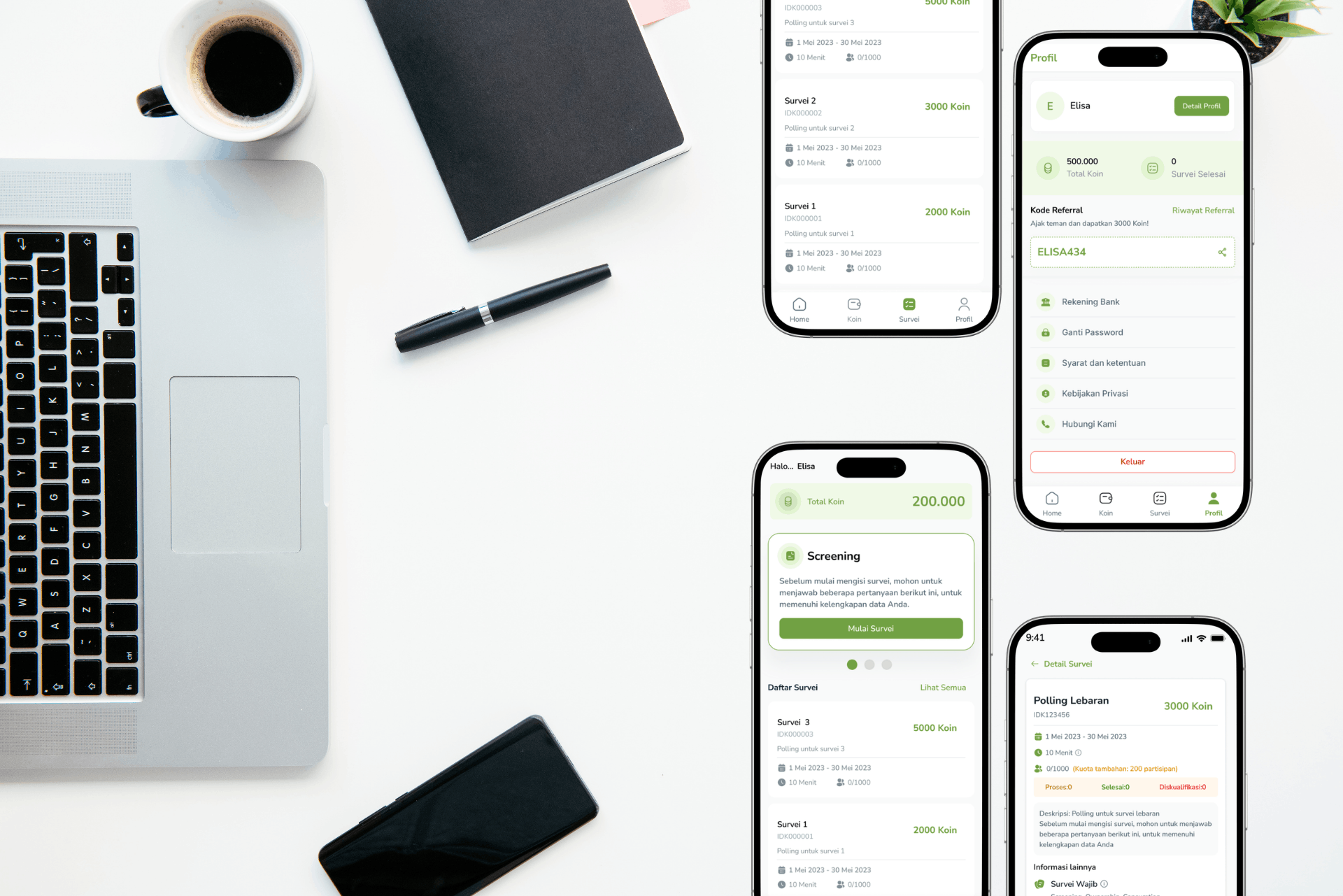 UI/UX
Koins
KOINS UI/UX design, a mobile-first savings app empowering 100K+ Indonesian users to build habits through gamification, targeting young professionals in Jakarta like myself who juggle gym routines, freelance gigs, and financial goals.
Read the case study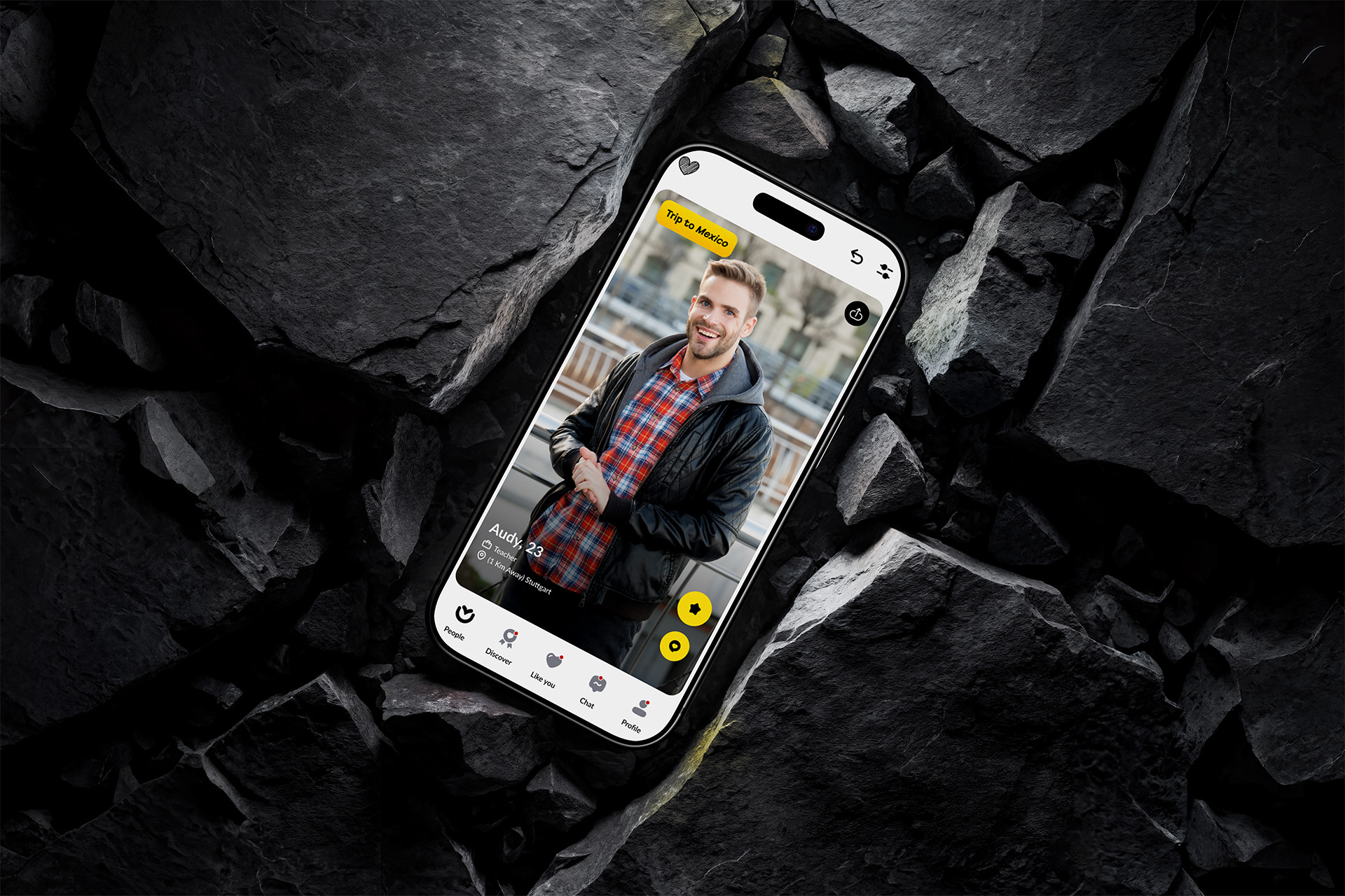 UI/UX
Lova
Lova is a dating app that helps you find your perfect match.
Read the case study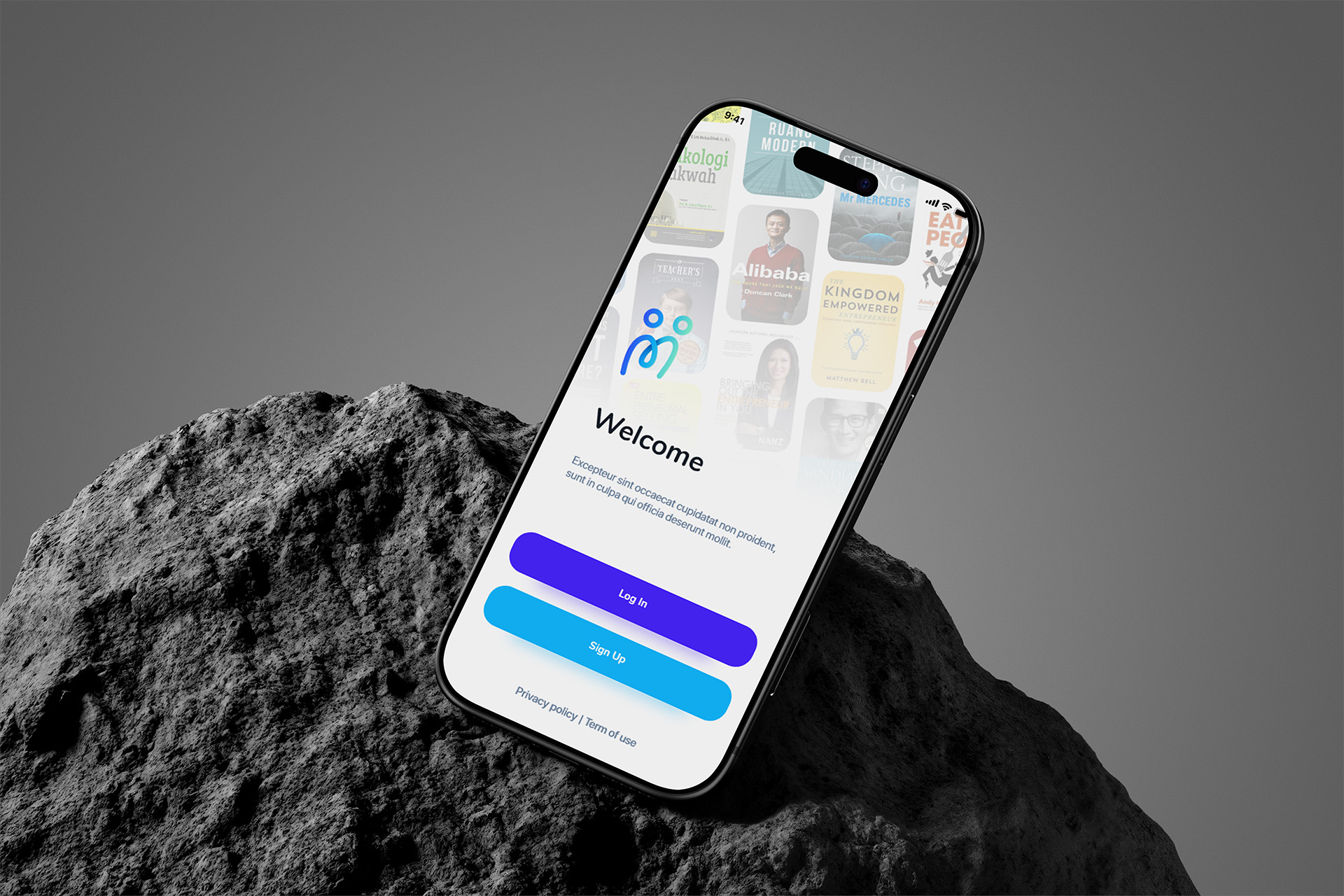 UI/UX
Mentor Gue
Mentor Gue is a platform that helps you find the right mentor for you.
Read the case study
Internal tools and customer portals are documented on the projects page. Where a workflow needs an assistant built in, see AI integration.
Pricing
Starting prices in IDR from our published price list. Screen count and research depth decide the final quote.
UI Design Basic
Fixed IDR 2.5 Million
- Most popular
UI/UX Design Pro
Starting from IDR 5 Million
UI/UX Enterprise
Starting from IDR 10 Million
Starting points. Prices in IDR. USD quotes confirmed per project. Third-party costs such as stock imagery, fonts or paid testing tools are billed at cost.
Design that continues into build is quoted as one engagement, so you do not pay twice for the same decisions. Post-launch design support starts from IDR 500k per month.
Frequently asked questions
We've heard it all. Here's everything you need to know before working with us.
Ask a questionWhat do we get at the end?
A Figma file organised by flow rather than a wall of artboards, tokens for colour, type and spacing, documented component states, and a handoff session with the people building it. Screens without states count as unfinished work.
Can you work from our existing brand?
Yes. Most engagements extend a brand that exists: we take the logo, palette and type, then decide which parts survive in a product interface and which need product-level rules. Decisions get written down rather than a second identity invented.
Do you write code too?
Often, yes — the same team builds what it designs in Next.js and React, which removes the translation step that loses detail. If your engineers build it, we stay available through implementation to answer questions and review early screens.
How do you handle accessibility?
WCAG AA is the target: contrast checked on real colour pairs, visible focus states, keyboard paths for every action, labelled fields and errors announced to screen readers. Cheaper to design in than to retrofit after launch.
Do you test designs with users?
Yes, with a prototype and a small number of people who resemble your users. We watch where they hesitate and misread, then fix the flow before development. Findings are written down, including ones that contradict our own preferences.