

Case Study: How a New Website Tripled Conversions
A small business does not always need more traffic to grow. Sometimes, it simply needs a better website.
In this studiy case: redesign website, we will walk through how a small F&B brand turned an underperforming site into a conversion engine. The brand is anonymous, but the numbers and process are based on a realistic project scenario we often see in the market.
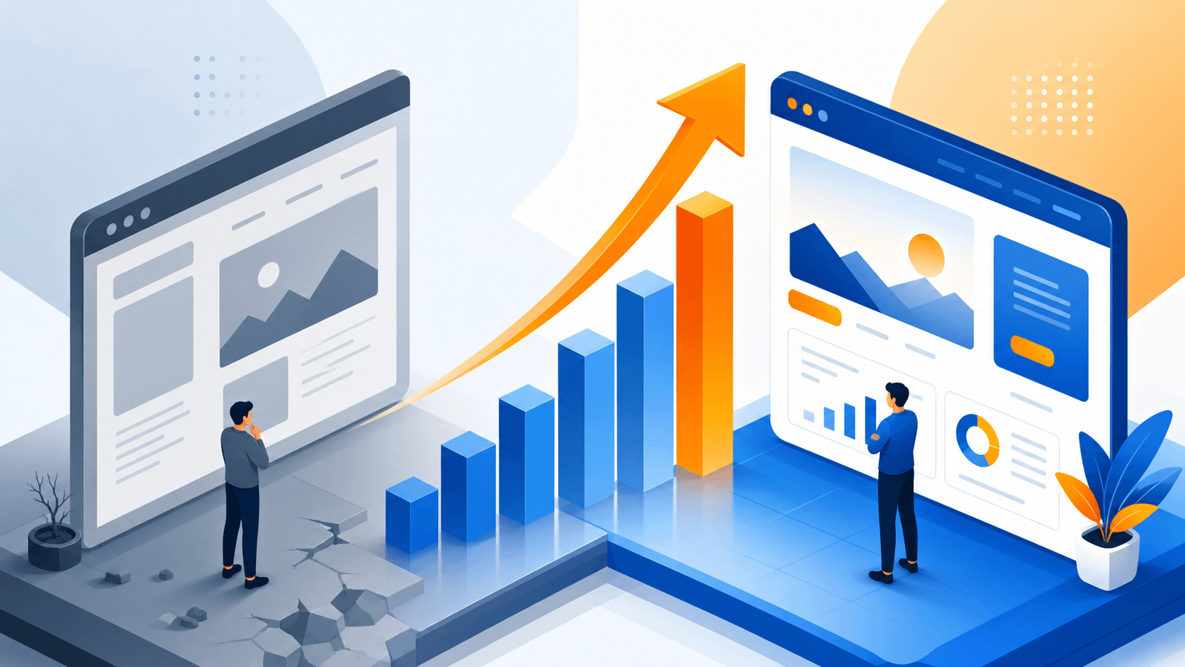
The result was not just a nicer design. After the redesign, the business reduced bounce rate significantly and nearly tripled its conversion rate. For business owners who want proof that web design can directly impact sales, this story shows what happens when strategy, UX, and user behavior are aligned.
Background: A Small F&B Brand With Big Potential
Our client in this case was a growing F&B business selling ready-to-eat products and catering packages in a busy urban area. Their products were well-liked offline, and they had already built a modest audience through Instagram and repeat customers.
Two years earlier, they launched their first website. At the time, the goal was simple: have an online presence and show that the brand looked credible. The site included a homepage, menu pages, a contact page, and a short brand story.
At first glance, nothing looked terribly wrong. The website had decent photos, basic company information, and a functioning contact form. But over time, the business began noticing a frustrating pattern. People were visiting the site, but very few were taking action.
Traffic from social media campaigns and Google searches was steady enough, yet inquiries remained low. The owner felt that the website was “there,” but it was not helping the business move forward.
That is when they decided to review the website not as a visual asset, but as a sales tool.
The Problem: High Bounce Rate, Low Conversion, and Friction Everywhere
When we looked at the data, the main issues became clear.
Bounce Rate Was Too High
The website had a bounce rate of 75%, which meant most visitors were leaving without exploring further. For an F&B business, this was a red flag. People were landing on the site, but something about the experience was failing to keep them engaged.
Several factors contributed to this:
- The homepage was text-heavy and slow to communicate the main offer
- Important actions were buried below the fold
- Mobile layout felt cramped and inconsistent
- Navigation had too many menu items for a small business website
In short, visitors were not getting clarity fast enough.
Conversion Rate Was Stuck at 1.2%
The site’s conversion rate was only 1.2%. In this case, conversion meant users taking one of the desired actions: sending an inquiry, clicking to WhatsApp, or submitting a catering request.
For a business that relied heavily on direct communication and fast response, this number was far too low.
The old website asked users to work too hard. They had to browse multiple pages just to understand the menu, pricing was not presented clearly, and the contact process felt formal instead of convenient.
Mobile Experience Was Holding the Brand Back
Most of the traffic came from mobile devices, especially from Instagram and WhatsApp referrals. Yet the website had clearly not been designed mobile-first.
Buttons were too small, sections were too long, and the menu structure created unnecessary friction. On desktop, the site looked acceptable. On mobile, it felt like a shrunken desktop website rather than an experience built for real users.
That gap mattered because the audience was not browsing casually. Many were hungry, busy, and ready to order. Every extra step reduced the chance of conversion.
The Solution: A Mobile-First Redesign Focused on Action
The redesign was not about adding flashy visuals. It was about removing friction and helping users take the next step faster.
1. We Rebuilt the Website Mobile-First
Since the majority of visitors came from smartphones, the redesign started from the smallest screen.
We restructured the homepage so users could immediately understand three things within seconds:
- what the business sells
- who it is for
- how to order or inquire
The new layout used shorter sections, stronger visual hierarchy, and clear call-to-action buttons placed at natural decision points. Instead of making visitors search for information, the website presented it in a simple flow.
This was one of the most important moves in the entire studiy case: redesign website process. A website that performs well on mobile is no longer optional, especially for local service and F&B brands.
2. We Simplified the Menu and User Journey
The old navigation tried to do too much. For a small F&B brand, that created confusion rather than trust.
We reduced the menu to only the most essential pages and grouped information based on user intent. Instead of sending people through multiple layers, we made it easier to browse products, view catering options, and contact the business.
We also cleaned up product presentation:
- clearer category grouping
- more scannable descriptions
- stronger use of product photos
- direct prompts to ask or order
The goal was to reduce decision fatigue. When people understand the offer quickly, they are more likely to act.
3. We Integrated WhatsApp Business More Naturally
One of the biggest missed opportunities on the old site was communication.
The business already used WhatsApp heavily, but the website treated it as a secondary option. That did not match actual customer behavior.
So instead of forcing users into a traditional contact form first, we integrated WhatsApp Business directly into the website journey. This included:
- visible WhatsApp call-to-action buttons
- click-to-chat placement on key pages
- pre-filled message prompts for faster inquiry
- better alignment between product pages and contact intent
This small shift made the website feel more practical. It met users where they already felt comfortable.
For many small businesses in Indonesia, this matters a lot. People often prefer instant messaging over forms, especially when they want a quick answer before making a purchase decision.
4. We Improved Trust Signals Without Overcomplicating the Design
Because the brand was relatively small, credibility had to be built quickly.
We added lightweight trust elements such as:
- customer testimonials
- clearer business information
- real product imagery
- cleaner brand consistency
These details may seem minor, but together they reduce hesitation. Good conversion design is often less about persuasion tricks and more about removing doubt.
The Result: Lower Bounce, Higher Conversion, Better Quality Leads
After the redesign went live and enough data was collected, the performance shift was clear.
Bounce Rate Dropped to 45%
The bounce rate decreased from 75% to 45%.
This told us that more users were finding the site relevant and easy to explore. The homepage was doing its job better, and the navigation no longer pushed visitors away.
A lower bounce rate does not guarantee revenue on its own, but it is a strong sign that the website experience is healthier.
Conversion Rate Increased to 3.8%
The most important result was the conversion rate increase from 1.2% to 3.8%.
That is more than triple the previous performance.
More visitors were clicking through to WhatsApp, sending inquiries, and taking meaningful action. Just as importantly, the business reported that incoming leads felt more qualified. People contacting them already understood the offer better, which made conversations faster and smoother.
The Business Felt the Difference Operationally
The owner’s feedback was simple but telling: the website finally felt useful.
Instead of being just a digital brochure, it became an active part of the sales process. Staff spent less time answering repetitive basic questions, and more inquiries came in with clearer intent.
That is often the hidden value of a smart redesign. It does not only improve metrics on a dashboard. It also improves day-to-day operations.
Lessons Learned: What This Case Really Shows
This project offers a few important lessons for businesses considering a redesign.
A Website Redesign Should Solve Business Problems
A redesign is not successful just because it looks modern. It has to address measurable issues. In this case, the real targets were bounce rate, conversion friction, and mobile usability.
When a redesign starts with business goals, the outcome is far more meaningful.
Simplicity Converts Better Than Complexity
Small businesses often assume they need to show everything at once. In reality, too much information can slow users down.
By simplifying the menu, clarifying the offer, and making contact easier, the website became more effective.
Mobile-First Is Essential for Local and F&B Brands
If most users discover your business through social media and messaging apps, your website must feel effortless on mobile. That is where first impressions happen.
Ignoring mobile UX is one of the fastest ways to lose ready-to-buy visitors.
The Best Conversion Path Matches User Behavior
Not every audience wants to fill out a form. For this F&B brand, WhatsApp was the natural next step. Once the website aligned with that behavior, conversions improved.
A high-performing website should support how customers actually make decisions, not how the business assumes they do.
Conclusion
This studiy case: redesign website shows that better results do not always come from spending more on ads or chasing more traffic. Sometimes, the biggest opportunity is improving what happens after people land on your website.
For this small F&B brand, a focused redesign led to a bounce rate drop from 75% to 45% and a conversion rate increase from 1.2% to 3.8%. The changes were strategic, practical, and built around real user behavior.
If your current website feels outdated, hard to use, or weak at turning visitors into leads, it may be time to rethink more than just the visuals. A well-planned redesign can create measurable business impact.
If you want a website that not only looks better but also performs better, explore how the team at kreasikita.co approaches web design with conversion in mind.